When Theresa May announced the snap General Election in April 2017, Labour’s Member Mobilisation team approached us at Forward Action. The party wanted to raise as much money as possible to support its grassroots campaigning and use the power of email to direct supporters to campaign locally. They asked us to come on board to help optimise their fundraising and online volunteer recruitment programmes.
Over the course of seven weeks, we helped optimise emails, and took a leading role in creating high-performing donate pages and volunteer forms to help achieve this. By the end of the campaign Labour had smashed their original targets, raising over £4m in 50 days, sums from online donations that are unprecedented in British politics.
What was our approach?
From the experience of working on the 2015 General Election, we knew that having a tight testing process would be crucial to taking advantage of the high volume of email going out every week. Every email that going out without a test would be a missed opportunity to raise more money or recruit more volunteers. So we:
- Set up daily check ins with the email team to make sure we could spot any opportunities for testing;
- Created a Trello board to track the progression of all the tests we ran;
- Prioritised significant front-end web development capacity to make sure we were flexible enough to respond to each testing opportunity;
- Recorded each test result in a dedicated testing blog and made sure the entire team was kept in the loop on newly established best practices by sending around regular summaries. This meant that learnings weren’t lost or left unimplemented and gains from successful optimisations accumulated over the campaign.
What were the results?
By the end of the campaign we had built and tested around 40 different email, donation page and volunteer signup page variants.
The testing programme produced around 15 successful optimisations, worth hundreds of thousands of pounds in extra donations over the campaign. We can’t share all the results for obvious reasons (mostly we don’t want to give the Tories ideas!) but here are six lessons we can:
1. Images can make a big difference to conversion rates
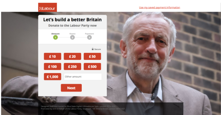
It’s one of the quickest and easiest tests to run, and we’ve regularly seen changing a background image on a donate page substantially increase conversions rates. So it was the first test we went for the opening weekend of the campaign.
Unsurprisingly, images of the Jeremy Corbyn came out on top – this image was the winner with an 11% increase in donate rate:
2. Sequential donate forms are still the way to go – on mobile as well as desktop
On desktop, the Labour donation form was “sequential” – i.e. you move through three different stages in the form, one each for choosing your amount, entering your personal details and entering your payment details. However, on mobile the form was one long page that the user had to manually scroll through.
The sequential donation form has been one of the most robustly effective donate page optimisations of the last few years, so we prioritised testing this layout on mobile early on. The design of the form was very clean and simple, with just a line of text and progress bar at the top:
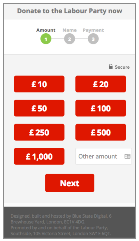
We found that the sequential layout increased mobile donate rate by a massive 38%, a hugely valuable uplift especially given it came early in the campaign.
3. People like PayPal
We know lots of people like making payments and donations online via PayPal, particularly on mobile. Tests with other clients have shown integrating PayPal options in charity donation forms can substantially increase donation rates.
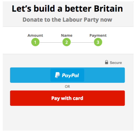
While the original Labour donate form did include a PayPal option, the user experience for anyone who chose it was not ideal. The button re-directed the user to PayPal’s (frankly awful) payment interface, where users had to manually re-enter the donation amount they’d already chosen. The PayPal option was also only available on mobile, not desktop.
The team thought this clunky user experience was suppressing the number of successful conversions, so we decided to test if we could increase conversion rate by more seamlessly integrating PayPal into the form.
We built a form with more comprehensive PayPal integration. It allows users to fill in the donation form as normal before simply entering their PayPal password to complete their donation. We also added the integration to desktop as well as mobile. We found that the new PayPal-integrated donate form increased donations by 22%.
4. Just one step more…
During the campaign, supporters were given the opportunity to fund the campaign by donating for a Labour tote bag. Progress bars – telling the user how far they’ve got to go before their donation is complete – are ubiquitous on e-commerce checkout forms, but the original merchandise page didn’t have one. We wanted to see if we could increase the amount raised from this action by adding progress elements to the merchandise page.
We first tested adding text at the top of the page indicating how many stages were left:
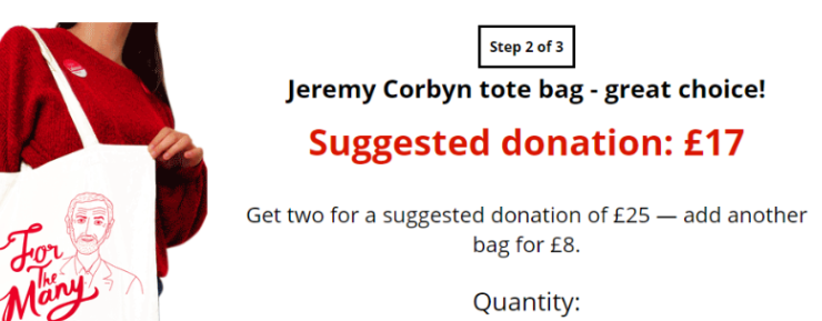
This increased the number of completed donations by 11%.
Once this result was established, we iterated it to see if we could further boost performance. The next test was a full progress bar at the top of the page, laying out each step from the start:

This new variant further increased the number of donations by 15%. The lesson here is that giving users information and context about what they’re doing – how long it’s going to take them, how many steps they have to go through, what they’ll need to do at each one – decreases the likelihood the user will give up halfway through. As a user, if you can see the end of the line you’re more likely to want to make it there.
5. It’s not just the ask that matters – it’s the buttons too
The majority of people on Labour’s email list at the start of the campaign had never made a donation to the party before. Converting as many of these supporters into first-time donors as possible was a crucial goal for the email fundraising programme.
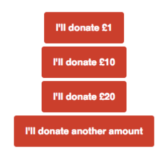
We found button formats in fundraising emails made a big impact on conversion rates. In one of the tests, for example, we tested two different sets of donate buttons on non donors. The first set included multiple donate options:
The second was just a £1 ask on its own:

Even though both formats started with a £1 ask, the difference in behaviour between them was huge. The £1 ask generated a statistically significant 45% higher donate rate – a huge increase. But the average donation of the multiple button variant was much higher – so much so that it raised 19.5% overall more than the £1 ask.
Given it raised so much more than the original £1 ask, we rolled out the multiple buttons variant to non-donors for the rest of the campaign. The lesson here: the options for donating you present to your supporters make a huge difference. Don’t stick with your single “Click here to donate” link – test different formats and see what works for your list.
6. To chip in, or not to chip in (and donate instead)?
One of the keys to a successful campaign email is, of course, having strong, compelling email copy. And that extends to the copy in your call-to-action.
We wanted to find out what language around donating Labour supporters responded to best. So we sent out a fundraising email with three button copy variants:
- “I’ll donate £x”
- “Donate £x”
- “Chip in £x”
We found that the more movement-y “chip in £x” increased donation rate by 9.4%.
We’re not suggesting everyone should start using “chip in” instead of “donate”. Not every email list will respond to copy in the same way – indeed, we’ve run this test with other clients and found no difference at all. But what this does demonstrate is that seemingly insignificant copy changes can in fact have a substantial impact – and the only way to detect and harness these impacts is to rigorously test your copy.
Conclusion
The Labour digital campaign rightly received a great deal of praise in the press at the time. The Labour team did a phenomenal job across the board, from social media to field to email fundraising. Digital has now taken a central role in political campaigning: social media enabled Labour’s positive, hopeful message to bypass the bile of the right wing press and speak directly to voters, while the funds that came in from small online donations enabled them to reach hundreds of thousands more people than they otherwise would.
If the 2015 election team we worked in establishing digital as an integral component of Labour Party campaigning, the 2017 team have shown how it can be a gamechanger. We applaud their dedication and skill, and are proud to have been able to play a small part in their success.