The organisations we work with use Facebook ads for a range of different goals: driving donations, email subscribers or video views, for example. But regardless of the goal, for Facebook ad campaigns to succeed it’s crucial to drive clicks from the right people as cheaply as possible.
To make sure we’re always spending ads budget as efficiently as possible, we regularly test new ideas to challenge and improve on best practice. And this testing can throw up some surprising results – here are just a few of the things we’ve learned.
Maps rule
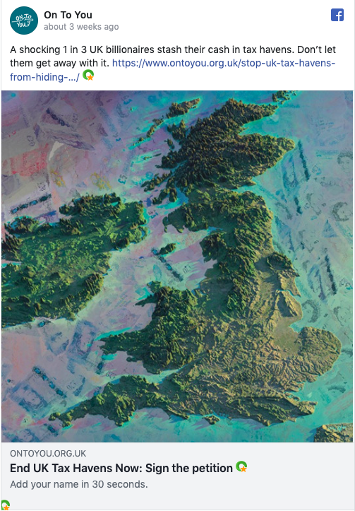
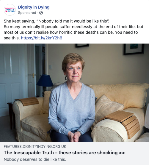
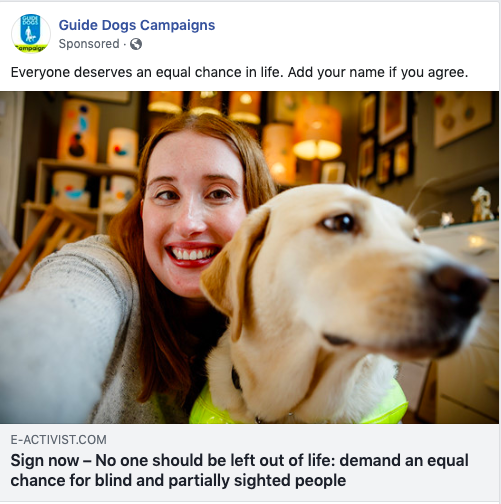
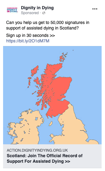
Images can sometimes be an afterthought of the creative process, but we regularly find the ad’s image impacts performance even more than the copy. A trend we’ve consistently seen in the past is that the more emotive an image is, the better it performs. But recently, we’ve found that in many cases maps significantly out-perform other more relevant or emotive images we test against, even if its geography isn’t particularly relevant or unique to the campaign.
It’s a fascinating result, and we’re still trying to work out why it is maps perform so well. Our current leading theories are 1) the simplicity of the graphic makes it stand out in people’s timelines, 2) if the map shows the country someone lives in this makes the campaign feel more relevant to them, or 3) a map gives a ‘current affairs’ tone, which appeals to the kind of people who tend to engage with progressive campaigns. But if you have any theories of your own, get in touch – we’d love to hear them.

Including a URL in the ad copy boosts conversions

It’s easy to assume that everyone knows that any part of a Facebook ad is clickable. But on one campaign, even though the copy had a clear call to action, we started to see comments underneath asking how to sign up. It wasn’t immediately clear to everyone they needed to click the ad.
So we included a page URL in the ad copy to see if this would increase sign ups – and it did, by 45%. It certainly doesn’t look pretty, but a URL link does scream ‘click here’.
Sometimes DIY is better
Facebook gives you the option to add a call to action button like ‘Sign Up’ or ‘Learn More’. But we’ve found in some tests that using a button actually reduced click rates, versus not having a button at all.
Instead, we’ve found it much more effective to include a tailored call to action in the headline copy. We’ve found a 40% increase in conversions for ads using a call to action in the headline, versus those without. Adding your own call to action in the ad’s headline means you can tailor the language to be as specific and compelling as possible – and it works.

‘It only takes 30 seconds’ beats ‘It only takes 10 seconds’

Our tests on email and action pages show that when people know the action is quick and easy, they’re more likely to do it. Facebook ads are no different; telling someone ‘it only takes 30 seconds’ can actually see conversions rise by 11%. We found that ‘30 seconds’ also beats ‘one minute’, which makes sense considering the quicker time should be most compelling.
But surprisingly, saying ‘it only takes 10 seconds’ actually produces fewer conversions than ‘30 seconds’. Our hunch is that quicker is only better if it still sounds realistic.
Test, test, test
Results like the ones above inform our work, but testing is a never ending process. There are always so many factors at play in an ad’s success, and it’s impossible to say that any of these findings will always hold true. But it just goes to show that data is always more illuminating than going off gut instincts alone.
Have you ever had surprising results with Facebook ads? We’d love to know.