So – you’ve crafted a compelling fundraising email, your Facebook ads are targeting the right people, and traffic is flowing to your donation page. But people aren’t donating at the rate you’d expect.
If your drop-off rate is high and your conversion rate is low, it could be that your donation page is slow, stressful or confusing to use. This not only reduces your income, but it could also damage how supporters see your organisation.
That’s why many charities are starting to use testing and optimisation to make their donation pages work harder for them; bringing in more donations without spending more on acquisition.
Optimisation simply means making small, step by step changes to your pages to make them the most effective they can be. You test how your supporters respond, then integrate the changes that perform best.
You don’t need in-depth skills or expensive tools to get started. In fact, we’ve seen small tweaks – like changing copy or images – generate really impressive results.
What does an effective donation page look like?
A successful donation page makes it easy to take action. It communicates quickly and simply what the supporter should do, and how.
Everything on the page steers and compels the supporter to donate, as quickly and effectively as possible, with nothing to cause distraction or friction that could cause drop off.
Optimising on a shoe-string
Finding the right copy and images can increase donation rates dramatically, and these are easy, low-tech changes to make. We suggest testing very different framings, headlines and background images and gathering data on which generate the most donations.
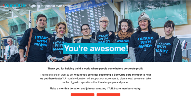
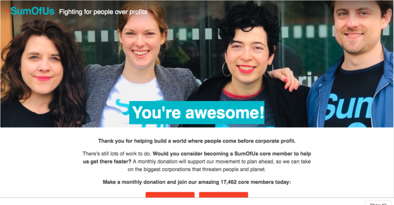
For example, when we tested the background image for this SumOfUs page, the second variant increased donations by 33% – a huge increase for such a quick change.
Other ways you can optimise your donation pages
A simple, clean design. Steer the supporter towards making a quick donation, with no headers or sidebars vying for their attention. A simple design could also mean removing any steps or form fields that are not 100% necessary (for example, postcode or marketing research questions – you can always ask over email later).
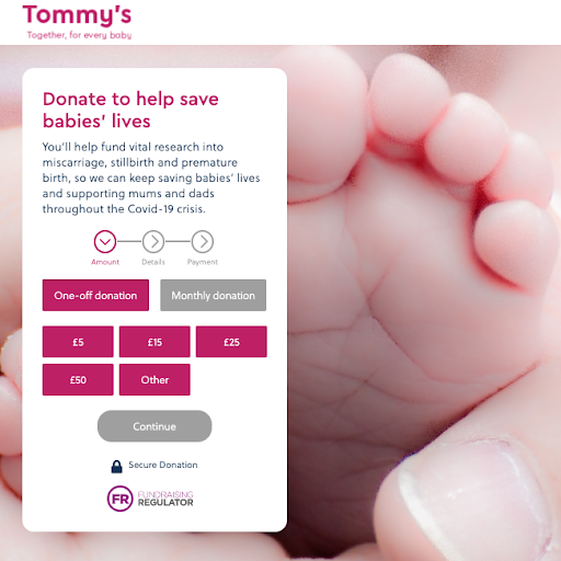
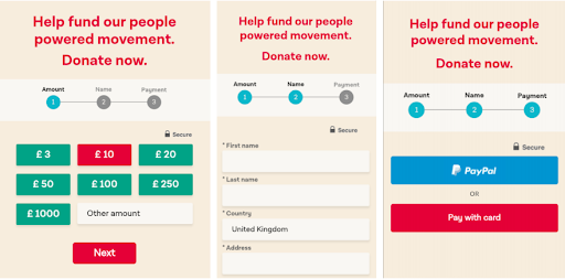
A step-by-step user journey. Breaking the donation process into bitesize steps creates a simpler user experience and reduces drop-off, by making each step feel quick and manageable.
In this example from the Labour Party, the supporter is shown one step at a time, along with a progress bar that shows what stage they are on. When we tested this against a single long-scroll form, the step-by-step increased mobile donation rate by a full 35%.
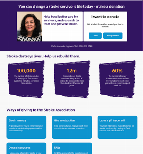
Remove unnecessary copy. We tested removing the additional copy on the Stroke Association’s donation page (everything beneath the purple header in the below image) – keeping only the headline, image, call to action and donate buttons.
With less copy to distract the user, the new page increased donations by 58%.
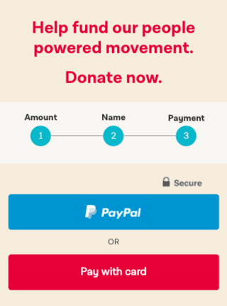
Use the tech your supporters use. For example, can you take payments by PayPal, or another commonly used platform? This could be quicker and more familiar for people, which can help to reduce friction and build trust. When we tested this on a Labour donation form, we found that adding a Paypal button increased donations by 22%.
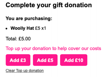
Add an upsell. It might feel strange but when someone has decided to give, it’s a great time to ask for a little more money – your supporter is already primed to donate.
In this example from Refuge, supporters were invited to ‘top up your donation to help cover our costs’ – a stunning 47% of people topped up their gift.
Likewise, we often add a direct debit upsell to the ‘thank you’ page a supporter sees after making a one-off donation. Typically, 3-4% of donors upgrade to monthly giving – with Refuge it’s been as high as 10%.
How to know what’s working
Whichever page element you’re changing, you need to A/B test your different variants to gather data on which works best.
Test in the wild with real users, to gather real data. And for clear results, only ever test one thing at a time (for example, test changing the background image first, then the button colours, and so on).
Want some support with testing and optimisation for your digital fundraising or campaigning? We’d love to hear from you.