Whether you’re tweaking opt-in copy for a list growth project, or optimising the user experience of a donation page: it’s all about data and results, not just what looks good.
That’s why testing should be at the heart of any digital strategy.
And here’s something even our most experienced strategists will tell you – when the data comes back, our assumptions are sometimes proven quite dramatically wrong.
Here are three times testing proved our hunches to be wrong (and why that makes us even bigger advocates for a data-driven approach).
Hypothesis 1: fewer options on a virtual gift page = better UX = more income raised
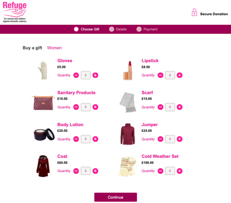
Ahead of the festive season we tested two variants of Refuge’s gifts page, which allows supporters to buy virtual gifts for women and children in one of their shelters.
We tried displaying either eight or 15 gifts, to see which would generate more income. Our hunch was that fewer choices would avoid users feeling overwhelmed and create a more streamlined user experience, leading to more purchases.

Contrary to our gut instinct, having more options on the page actually encouraged users to buy more gifts (by 38%). It also nudged them towards higher value gifts – raising 61% more income compared to the variant with fewer options.
Armed with this data, we were able to maximise income over the Christmas period by rolling out the winning variant.
Hypothesis 2: a messenger bot = more personal touch = more event sign-ups
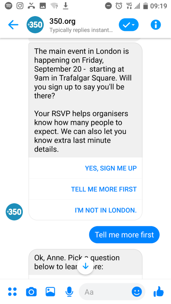
350.org set up an event page for the global climate strikes and asked us to test how to generate the most sign-ups for the lowest cost.
In an initial test we drove traffic (via Facebook ads) to a chatbot sequence in Messenger, versus a sign-up web page, to see which would perform best.
Our gut instinct was that Messenger bots would drive more sign-ups, since they offer a personal, interactive experience where the user can ask questions before they commit to attending an event.
However, the results showed a high drop-off rate with the Messenger bot, and a higher cost per sign-up. It turned out users wanted a more typical sign-up experience – the event page got 17% more sign-ups than the bot.

Hypothesis 3: emotive images in Facebook ads = more clicks
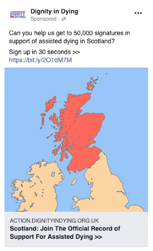
We tend to find that emotive images, or ones that tell a story, are the most successful in Facebook ads. So working with Dignity In Dying, we assumed images of terminally ill campaigners would encourage more people to take action.
But there is one type of image that seems to outstrip all others: the map.
Images of UK maps consistently drive more people to take action at a lower cost. We have seen the phenomenon with other partners too. Our theory is that maps feel authoritative, relevant, and many of us have a strong connection to our place in the world.
It’s not a hard and fast rule, and it remains important to test creative variants for every campaign. We try to include a map whenever possible to further test this result.

Our final thoughts
Testing and optimisation should be at the heart of all digital work. Whether that’s something small like launching a Facebook ad campaign, or something big like building digital fundraising pages.
No matter how great the results or the creative ideas, digital mobilisation can always be more cost-effective, engaging, and drive more action for your cause. And results are more reliable than our instincts.
If you’d like to see how testing and optimisation can improve your digital campaigns, please feel free to get in touch.