At Forward Action, we’ve run hundreds of A/B tests over the last 8 years to optimise our landing pages and follow-on journeys.
The result is a huge stash of knowledge about what works – and what doesn’t.
We’ve distilled all this into our powerful Blueprint platform that enables you to create high-converting sign-up forms that deliver incredible results.
Pages built with Blueprint have achieved a 66% average opt-in rate (2022), a 40% increase in donations after signing and a 20% increase in shares.
Sharing our insider tips…
Blueprint has produced game-changing results for organisations including Stonewall and Freedom From Torture. And it helped Good Law Project bring in 50,000 new supporters with a 675% return on ad spend.
Are you curious about the winning principles behind our approach and keen to know how to supercharge your sign-up journeys?
Here’s our tried and tested optimization advice, based on 8 years as an agency and hundreds of A/B tests…
1. Keep your design clean and simple

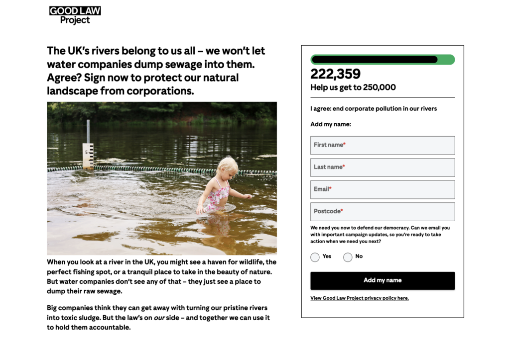
To maximise conversions, you want people to stay totally focused on the action you’re asking them to take.
That means removing visual distractions or unnecessary info, and keeping your design and UX as simple as possible.
Make sure your page is mobile optimised too. Consider using shortened body copy on mobile with a ‘read more’ link. This way, people can see the top of the sign-up form without having to scroll.
2. Use punchy, emotive, action-focused copy

Your words need to grab people’s attention and inspire them to act, all within a minute or two.
Write in punchy sentences and paragraphs. Bring the issue to life with a short, emotive description. And use language that appeals to people’s values – about what’s right and wrong, the essential things everyone deserves, the kind of world they want to live in.
If you have any shocking statistics, include one or two to underscore the scale of the issue. But don’t overdo it – if you use too many numbers, they’ll lose their impact.
3. Have a really clear call to action

Your headline should be a rallying cry that says specifically what you want people to do and why. Interestingly, we’ve found that long headlines can work really well, if they’re persuasive enough.
In the page copy, bring in your theory to change to make it clear how people signing up will help solve the problem you describe.
Show that they’ll join a community of people who share their values, all fighting for the same thing. And end on another clear, concise call to action that references the impact they will make.
4. Include a signature counter
Social proof can be a powerful motivator.
By including a counter above your form showing how many people have signed so far, and inviting your users to join them, you can create a sense of community.
You’ll also reinforce the idea that signing is a good thing to do, since so many other people have.
5. Don’t have too many form fields
Only collect data you really need. That might be as simple as people’s first name and email address.
The more pieces of personal information you ask for, the more reasons you’re giving people to decide against completing the form.
So, if your goal is to get as many sign-ups as possible, it’s usually best to ask for less.
6. Make your opt-in irresistible

The secret to a successful opt-in is to make it an opportunity that’s hard to refuse.
We’ve found a specific structure for opt-in asks that works really well:
- Start with a short, compelling sentence or question.
- Ask if people want to receive your communications and outline what you’ll send and why, making the benefits clear.
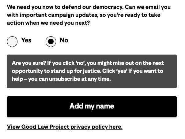
- Use ‘Yes’ and ‘No’ radio buttons, so people have to actively choose.
- If users choose ‘No’, include some pop-up copy asking if they’re sure, and explaining what they’ll miss out on if they opt out.
- Make sure you’re following GDPR best practice.
7. Don’t stop at the sign-up page

When someone’s just signed up to your campaign, they’re at their most engaged – so it’s the perfect moment to invite them to do more.
That could be donating, sharing your content, sending an email, joining a webinar, signing up to an event, reading a blog or something else.
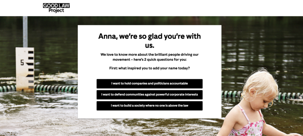
Chaining together several post-signing actions, one after another, can be really effective. We’ve even found that asking people why they signed before you ask for a donation can raise more money. Run A/B tests to see which combination works best for you.
8. Use a scrolling structure
Frictionless UX is crucial to maximise conversions in your post-signing journey.
By using a scrolling structure – where the user stays on the page, and when they respond to each ask a new one moves up (rather than loading a new page each time) – you can create a streamlined experience.
When actions flow like this, it’s easier to hold people’s interest and win more conversions.
Take a look at Blueprint
Blueprint offers every single technical optimisation described here and more in one easy-to-use platform. It’s:
- simple to set up and use, so you can launch campaigns quickly.
- designed to integrate easily with your existing systems.
- able to track activity and deliver data so you can measure impact and make decisions.
Got questions?
You can read about Blueprint’s features, benefits and pricing here, or complete this form to set up a free demo call.