Following on from priority Tier 1 tactics in the first blog (we’d suggest giving it a read first and them coming back, if you haven’t already), this blog covers Tier 2 tactics – i.e. optimisations that will help you maximise advocacy or fundraising actions from the increased traffic to your channels. We’ve ordered these roughly by priority – i.e. the tactics with the highest potential returns first.
Tier 2 – Quick-to-implement optimisation wins to make the most of increased traffic
Action pop up on your website homepage
A number of organisations have reported seeing a big spike in organic website traffic over the last week or so. A lot of these extra visits will be from people who are looking for a way to help, so you need to make it as obvious as possible what the most valuable thing they can do right now is, then make it as easy as possible to do it.
In testing, we’ve found a homepage popup that loads as soon as the user lands on your site is an effective way to increase action rates on a priority ask. Here’s a live example from SumOfUs.
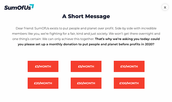
People coming to your website will typically be a much more engaged audience than people you’re reaching through social media or even email. After all, you haven’t had to reach out to them – they’ve made a proactive effort to come to you. So make sure that you’re giving them a suitably high value action to take in this popup – i.e. more than just sign and share a petition or handraiser. That will most likely be a fundraising ask for a lot of orgs, but you could also use this space to promote a high value volunteering ask, for example.
If you can, draft two or three different versions of the call to action copy and set them up as an A/B test within the popup to maximise action rates. You could also test embedding fundraising asks as banners/footers at the top or bottom of your other content pages, Guardian-style.
Thank you page with Direct Debit upsell for people who make a one off donation
Example here. Contrary to what most of us might intuitively assume, all the data we’ve seen shows the moment when people have just taken an action is the perfect moment to ask them to take another one, because they’re still highly motivated and engaged with your cause. This even applies to donations: across different organisations, we typically see 3.5 – 4% of one off donors immediately set up a monthly donation through an upsell ask on the thank you page. We also don’t know of any cases where organisations have received complaints from supporters unhappy to be asked for a monthly donation through this page.
From a creative perspective, the key thing is for the page to thank people first and foremost. It should then make the case for why setting up a monthly donation will have additional impact, on top of the one off donation they just made – it’s important the supporter understands them as distinct asks. As ever, A/B test two or three copy variants if you can.
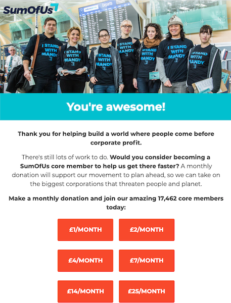
Automated Direct Debit upsell email for one off donors
Same principle as above – set up an automated email that is sent to people immediately after making a one off donation. It should thank them then make the case for setting up a monthly donation.
Fundraising footers in your non-donation emails
If you’re sending out non-fundraising emails over the next few weeks, including a fundraising box at the bottom of your email can be a good way to generate additional donations through a “soft” ask which doesn’t detract from the main content or action of your email. In some emails, we’ve seen these footers bring in as much as 50% of the income you’d expect from a “hard” fundraising email, so they’re worth doing. The copy should be urgent and covid-related if appropriate (more on messaging in blog one).
In these footers, we tend to find relatively long copy which makes an emotive donation case improves performance. The same applies with the website popup we’ve outlined above – and incidentally, this is also the approach The Guardian, who do extensive testing of ask copy, take with their in-article asks. But again (guess what’s coming?) A/B test two or three different copy variants if possible, with a range of different framings.
Including donate buttons rather than text links is a safe bet and probably not something you need to test – we’ve always found buttons improve performance in testing.
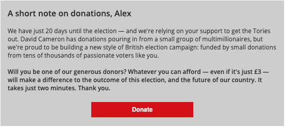
Here’s an example of a well-performing footer design and copy from Labour 2015 days:
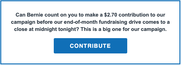
And a more recent one from Bernie 2020’s fundraising team:
Ensure your Facebook Fundraising tools are turned on
It’s free and easy to do and even if you’re not putting any work into actively promoting them (and there’s lots you can do on this, which we’ll aim to cover in a future blog), this will allow any supporters who want to to set up Facebook fundraisers for you and donate directly through your Facebook page.
—
We’ll be following up with a blog on Tier 3 – tactics with a longer lead time, but with potential to deliver high returns over the next few months – in the next few days. Thank you to everyone for all the amazing work you’re doing – it’s been really inspiring seeing how much our sector has stepped up to the crisis over the last few days. Look after yourselves!
Update: Our third instalment is now ready to read – click here to take a look.
