If you’ve been to one of our Building Digital Power events, you’ll know we spend a lot of time thinking about what progressive movements can learn from how the radical right are using digital channels.
So when Who Targets Me highlighted that Reform outspent Labour on paid social last week, we took a deeper look at their website, which relaunched earlier this year. Here’s what stood out:
1. It looks like a crypto startup, rather than a political party
The website is dark, bold, and slick, feeling more like a cryptocurrency platform than a traditional party site. That probably isn’t a coincidence. Reform has pledged to make the UK a global hub for crypto and recently received the largest donation in British political history from the crypto billionaire, Christopher Harborne.
But our takeaway here is that the new site speaks to an audience that’s sceptical of traditional politics and traditional politicians. It’s visually shouting “we’re not like the establishment”.
The way your website looks tells people whether it’s meant for them or not, and to do that you have to know your audience, and what’s going to connect with them.
2. The live membership counter – and what happened when they took it down
Reform supporters are just like everyone else: they love a counter.
The site prominently displays “270,000+ members”, which makes the movement feel real, growing, and worth joining. That’s why we always recommend a counter on sign-up pages, but where else could we be showing the scale of what we’re building?
Reform previously went one step further with a live ticker showing membership numbers ticking up in real time. When they quietly removed it in January 2026, people cared so much that independent websites popped up to keep tracking the number.
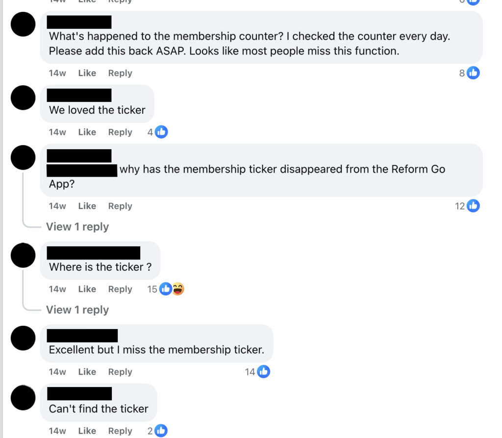
If your supporters feel connected to your story, they want to watch it grow.
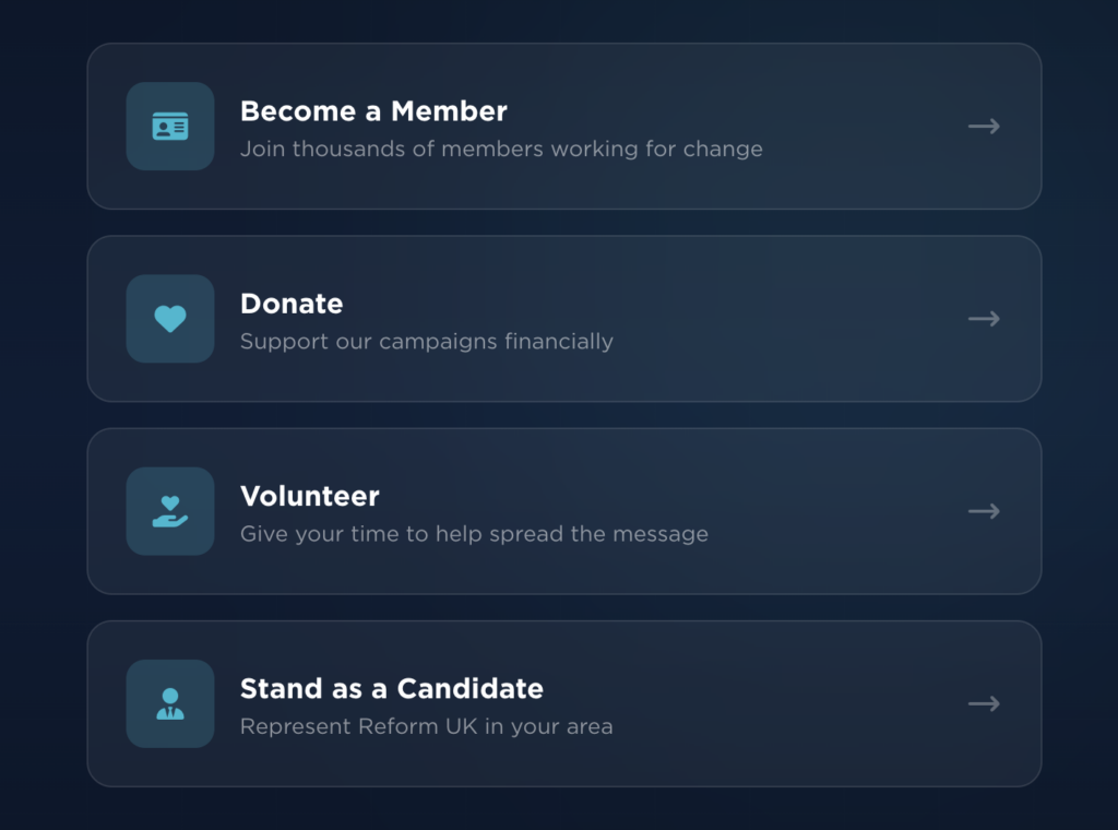
3. They make it really obvious what they want you to do
Every part of the homepage points you toward three things: join, donate, or volunteer.
There’s no confusion. And the language is very direct: “Membership just £25 per year” sounds more like a subscription than a political party ask. It’s worth asking ourselves: how often do our websites try to explain everything before they ask for anything?
The most helpful thing you can do for a visitor is just make the next step really, *really* clear.
4. A members’ app – and what it’s really about
Reform has their own mobile app, ReformGo, where members can get event tickets, exclusive content, and access their account. Most organisations don’t have the resources to build an app (nor would we necessarily recommend it, even if budgets were endless!), but the idea behind it interests us.
Reform is trying to create a space supporters return to regularly, rather than relying on one-off website visits. Once someone’s on your website, how do you stay in touch with them?
For most of us, the answer is email. Are we making the most of that?
5. Volunteering is a clear step on the journey
The website lays out a clear path: join, then volunteer, then become a local organiser. Each step is explained and easy to find. On a lot of campaign sites, volunteering is buried in a menu somewhere and could be seen as an afterthought.
If getting people actively involved is the goal, it should be one of the first things they see.
The politics are pretty bleak. The website, however, knows what it’s doing.
These are just a few things that stood out to us, and to be honest we didn’t want to spend more time than necessary on Reform’s website, but with the money they’ve got to throw around at the moment, it’s always worth checking what they’re up to.
Our key takeaways are
- Know your audience and use design to speak to them
- Use progress counters to tell a story
- Give clear and upfront asks, and be transparent about where you’re taking your supporters
- Make the most of your channels and keep in touch with your supporters