Happy Red Nose Day!
During these 24 hours, thousands of people up and down the country will make a donation. Many of those will donate online. That means there’ll be a lot of traffic through the Red Nose Day donate form — which is a great opportunity to run A/B tests to optimise the form and raise more money.
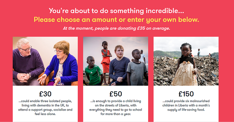
This is what the Red Nose Day donate page currently looks like (why not make a donation while you’re there).
This year, it’s looking great. It uses a light, clean design; the page is split out into a user-friendly, stage-by-stage format; and there’s a clear focus on the action the user needs to take at each stage. But the work of optimising a donation page is never done — and given Comic Relief can be expecting to raise upwards of £100 million for Red Nose Day, even an increase of just a few percent in donate page conversion rates could be worth millions of pounds.
So here are the 8 tests we’d love to perform on the Comic Relief donate form this Red Nose Day to make sure every drop of performance is squeezed out of it:
(1) A different form layout.
First up: the biggest test we’d run.
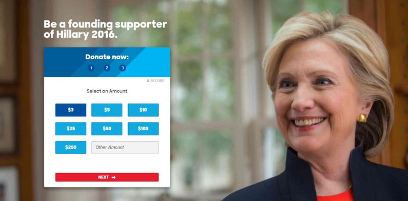
WHAT? We’d test making the form layout far more compact. Possibly placing it on the left of the page, with an evocative image on the right a la this Hillary donate page.
WHY? This format is widely used and routinely tests well. Some of the biggest online fundraising campaigns in history — notably Obama 2012 and Hillary 2016 — have used this layout for their donation pages. A major advantage of this compact layout over the current Red Nose Day page is that the first action you have to take — choosing your donation amount — is “above the fold” of the page on a 13 inch laptop — i.e. you don’t have to scroll down the page to see where you need to click.
Given its past success and status as a widely-used best practice layout, this would be our go-to first test.
(2) Make the header action-focused
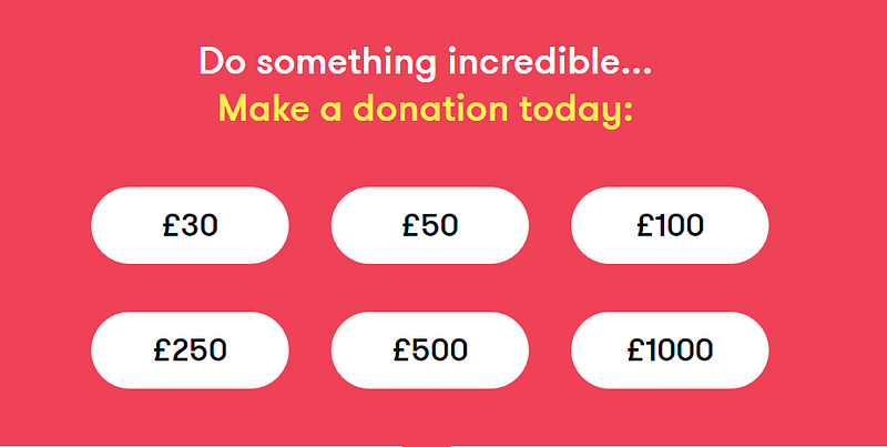
WHAT? We’d change the header text from: “You’re about to do something incredible…Please choose an amount or enter one below” tosomething like: “Do something incredible. Make a donation below”.
WHY? They don’t call it the call-to-action for nothing: testing consistently shows that make ask language as direct and punchy as possible leads to better action rates.

(3) Strip the page design down
WHAT? We’d test removing the stories on the landing slide and leaving just the donate amount options.
WHY? We love the pictures and donation stories they’re using on the page right now. But often, more information on an action pages reduces conversion rates, rather than increasing them. If a user feels like they have to read a lot of text before they can take action, or is overwhelmed with choice of what to read and where to look at, it can lead to them giving up before they complete the donation.
(4) Different stories
WHAT? We’d test a bunch of different stories in different positions and see which ones bring in the most donations.
WHY? When we said we love the stories, we really meant it. But we’d definitely want to make sure we’re using the most impactful stories.
NB: It looks like this test is already running. We saw different stories when we visited the page at different times.
(5) Add an average donation
WHAT? We’d test adding a line such as: “At the moment, people are donating £35 on average.”
WHY? Telling people how much other people are donating gives them a baseline of how much they should donate. We’ve found in testing this use of “social proof” — giving evidence of what other people are doing to encourage you to do the same — can substantially increase average donation amounts.
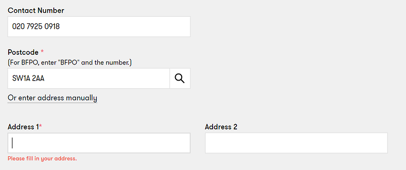
(6) Make the address field more user friendly
WHAT? We’d put the “Address 1” field next to the postcode and make it visible to the user as soon as they land on the page. At the moment it’s hidden.
WHY? Reducing friction and user error increases form conversions. Here’s a great blog post by Kyle Rush of OFA and HFA fame, explaining how they reduced this to increase donation conversions.
Because it’s hidden, we missed the Address 1 field, even though it’s required. When we tried to submit the form we got an unexpected error and had to scroll all the way back up to fill it in properly. You can see this below:

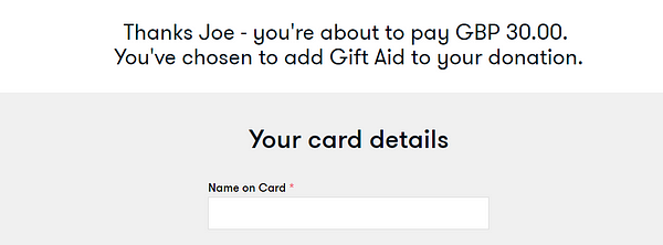
(7) Personalise calls-to-action for the user
WHAT? We’d take advantage of the fact the user enters their first name before they reach the card details page and use it to tailor the call-to-action to them. There are a couple of ways this could be framed:
WHY? We’ve seen this sort of personalisation (done in the right way) increase donations by as much as 30%. Very simple, but surprisingly effective.

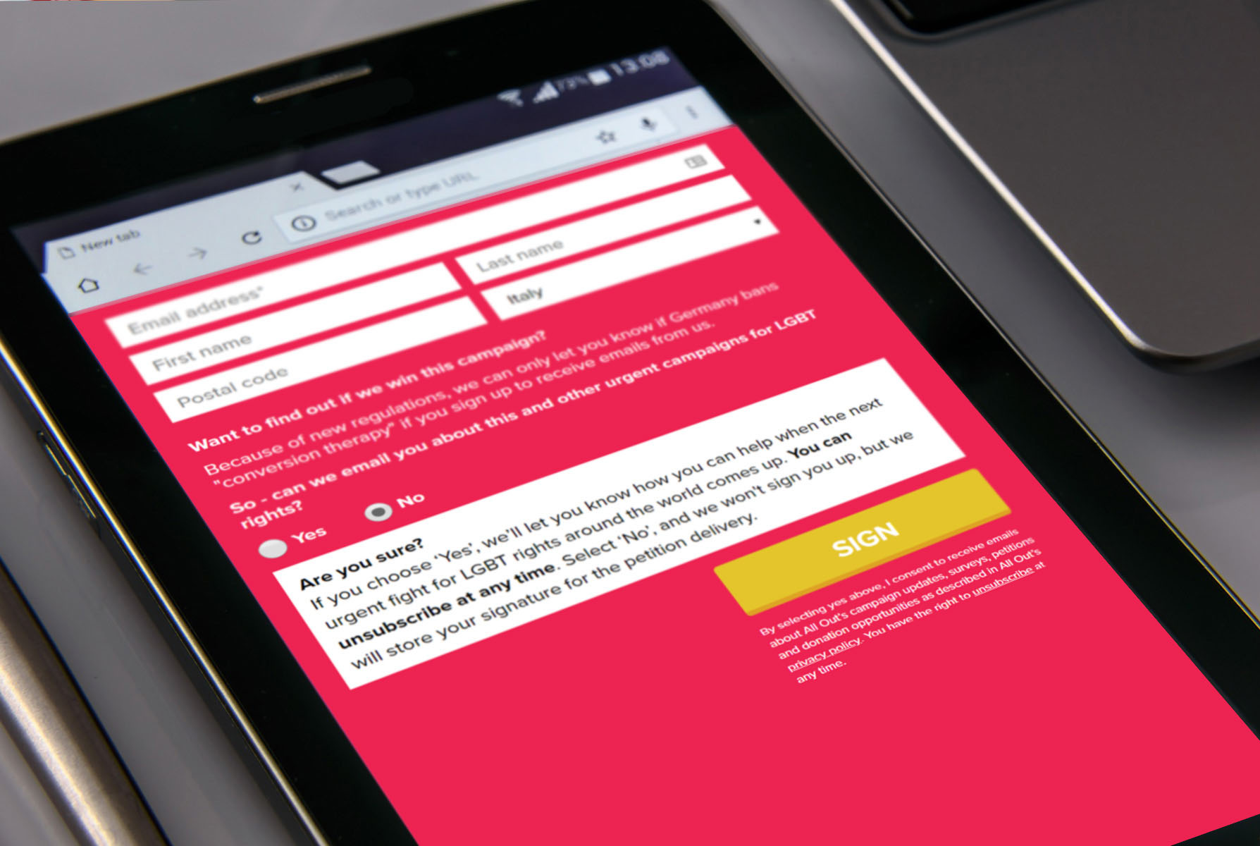
(8) Move the opt-in box
WHAT? We’d test moving the communications opt-in to after the card details stage.
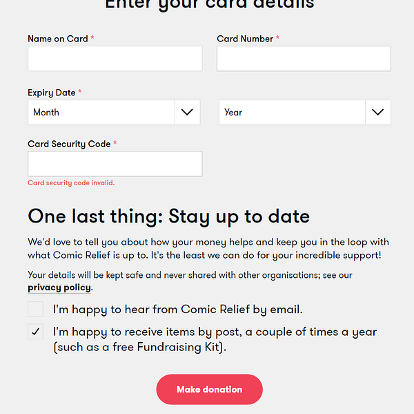
WHY? At the minute, the opt in box is right slap bang in the middle of the donor’s journey. It feels naturally like an end-of-donation action, rather than one that interrupts the middle of the donation process. We’d test moving the opt-in to after the card details page (see the screenshot). The theory we’d be testing is that after the user has invested more effort to make a donation (i.e. by entering their card details, the most onerous part of giving a donation) they’ll be less likely to drop off at the opt-in stage.