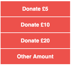
A consistent test result we find is buttons beat text links, and that stacks of buttons with different ask amounts (£5, £10, £20 etc.) beat single “Donate now” buttons in fundraising emails. So we built a tool to make creating these buttons and button stacks easy.

You can use the tool to change the number of buttons, button height/width, font size and colour. The code is designed to be email friendly and, because it generates CSS and HTML code rather than images, doesn’t reduce deliverability.
You can also save your settings as “layouts” so you can easily return to them without having to manually change all the settings each time.
We hope you find it useful!